

Discovering The Need
Lozen Pharma redesigned their website to address these four key issues:
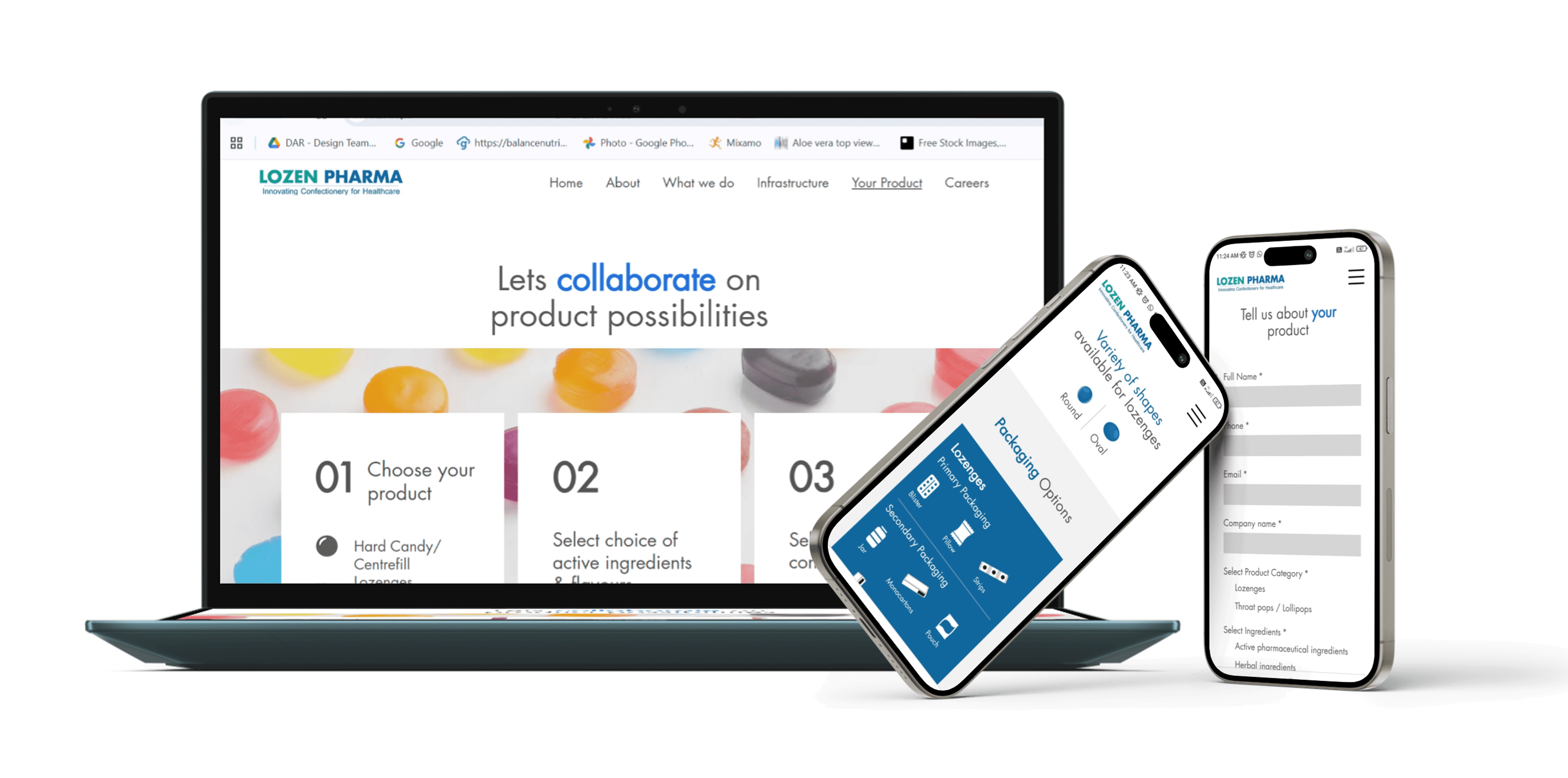
Weak Lead Generation: The old site lacked clear calls-to-action (CTAs). The redesign added a "Your Product" journey to capture leads by allowing users to customize orders.
Poor Brand Clarity: Visitors couldn't easily understand Lozen's specialized services. The new site uses scannable layouts to highlight their global reach and manufacturing tech.
Outdated User Experience: The previous site was difficult to navigate. The redesign improved information architecture, making it easier for B2B clients to find certifications and R&D details.
Lack of Professionalism: To compete in global markets (like the USA and Russia), they needed a high-fidelity, mobile-responsive site that reflected their status as a modern, high-tech pharmaceutical leader.

Solutions Provided
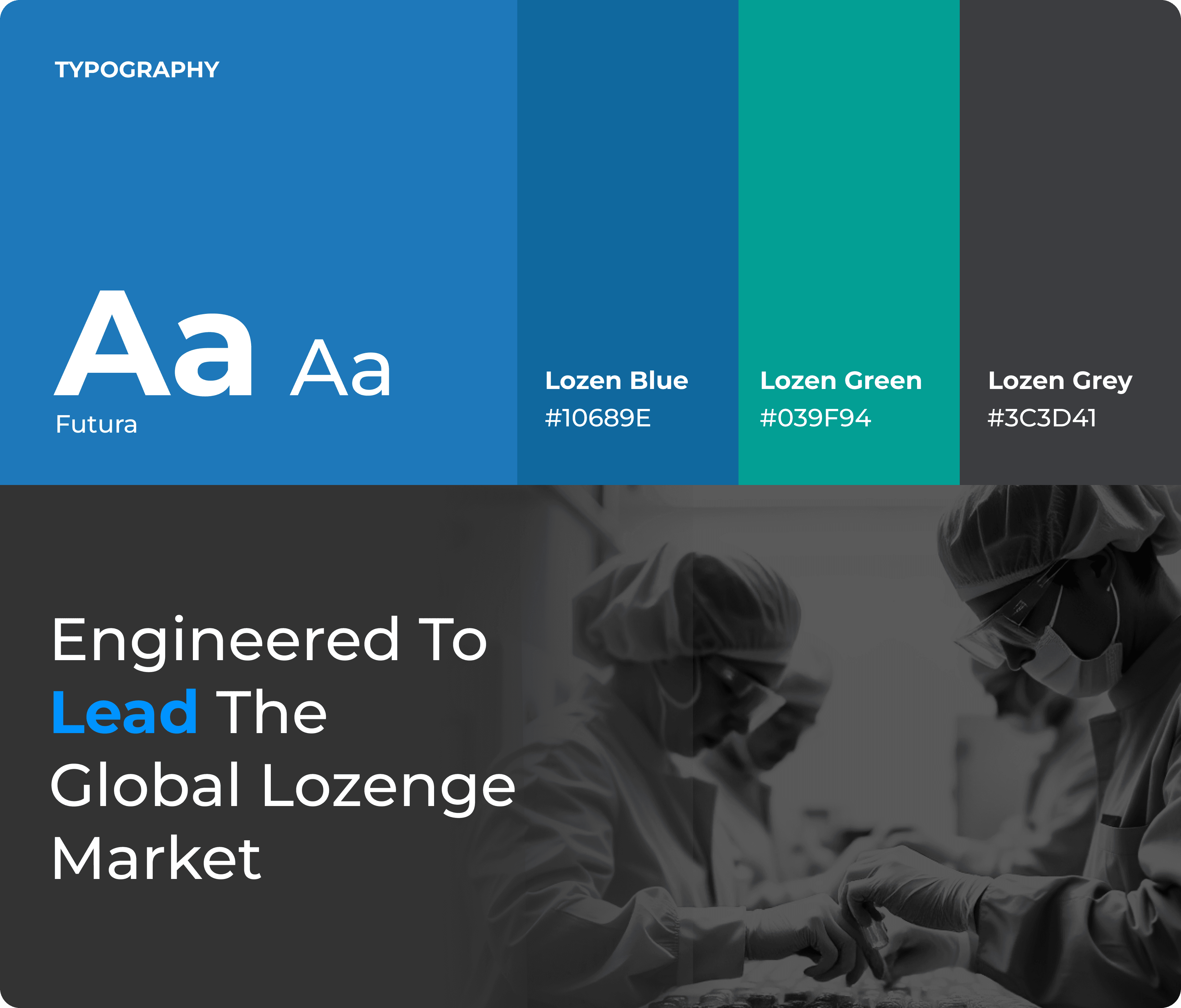
Typography & Style

01. The Home
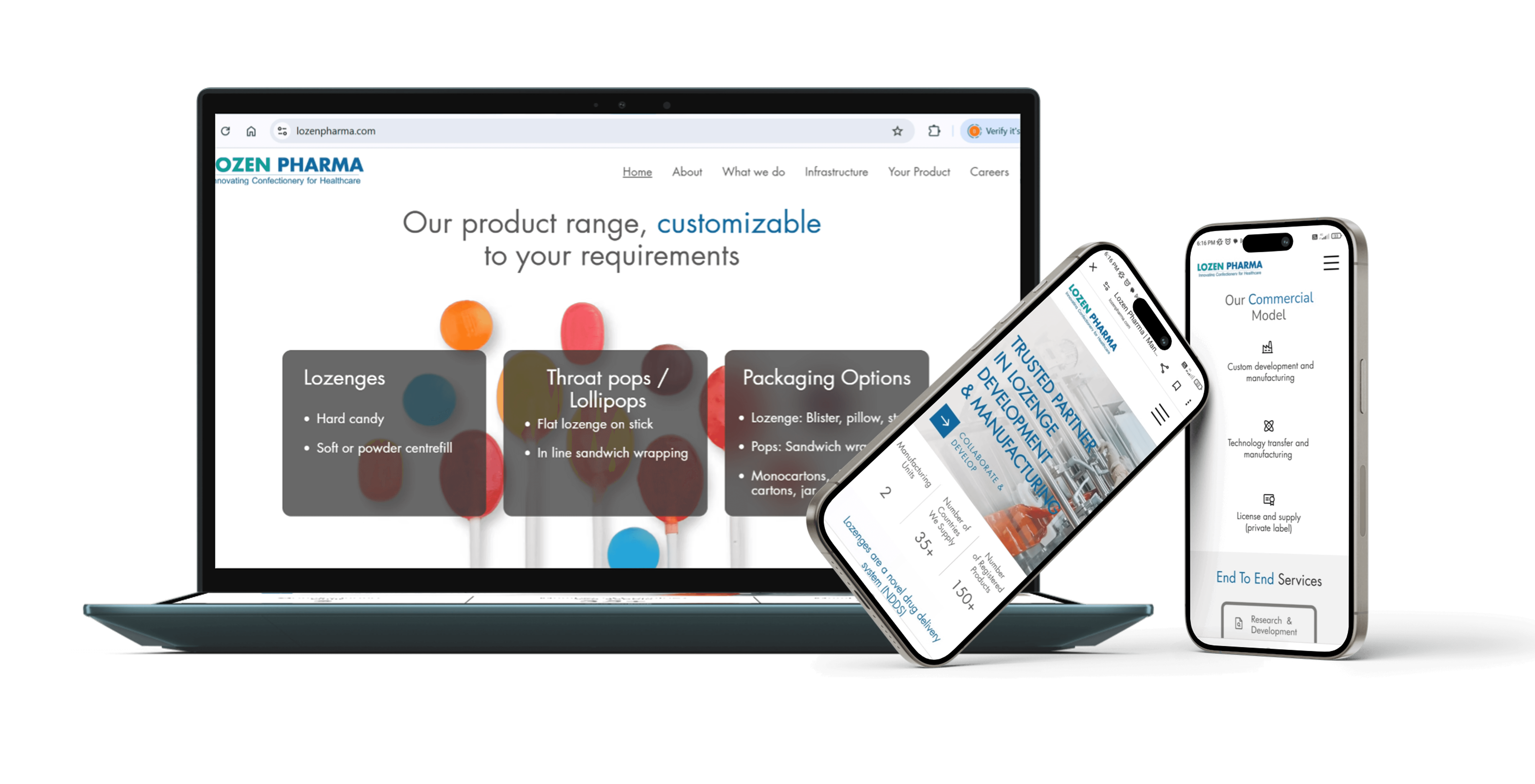
Launched the "Collaborate & Develop" portal to drive lead submissions, backed by a global footprint of manufacturing units and registered products. The model focuses on concise, scalable service delivery and shared-growth partnerships to maximize brand impact.
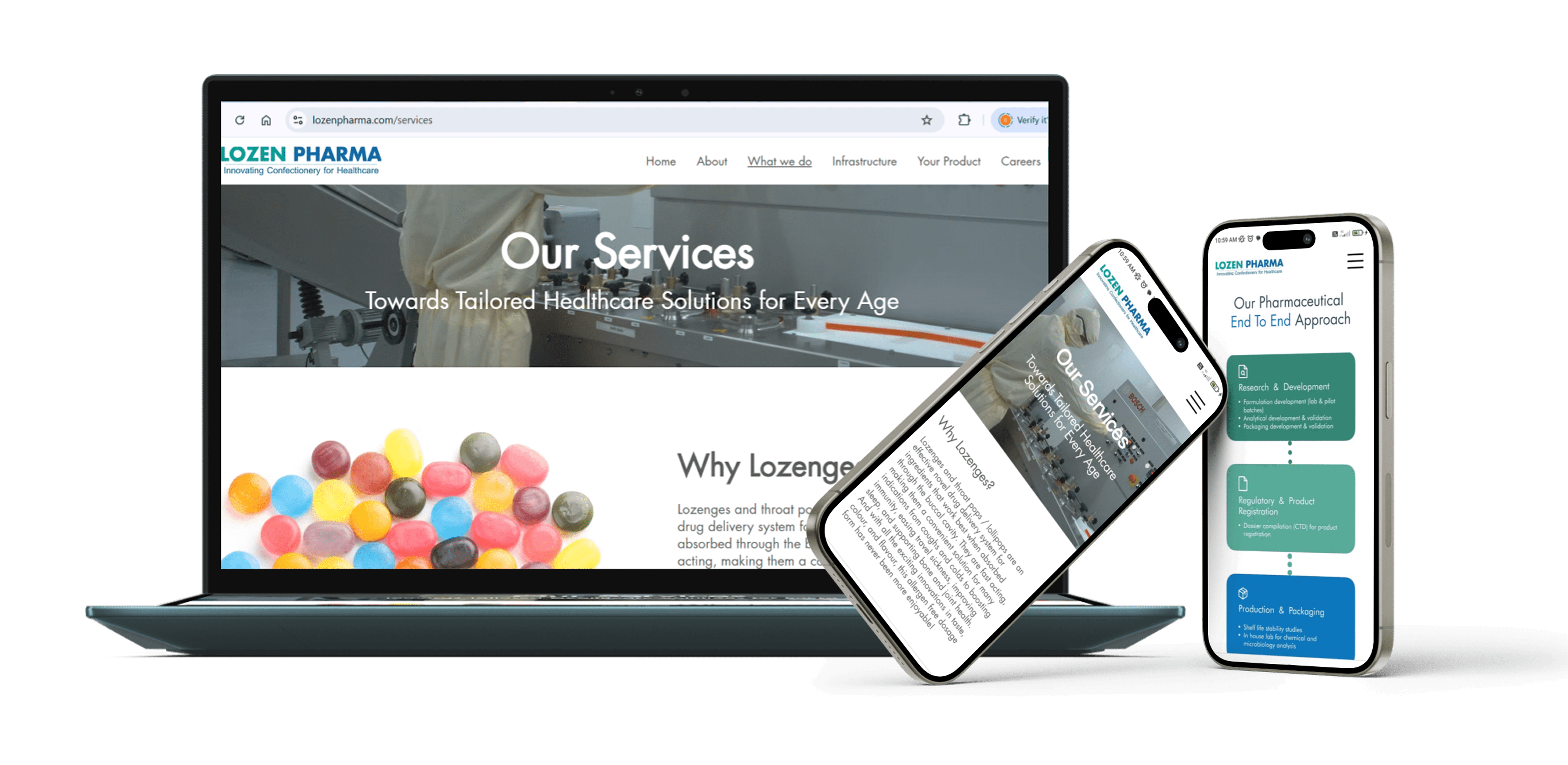
02. Strategic Process Transparency
Visualizes the end-to-end pharmaceutical lifecycle from R&D to QA, while providing a concise, text-based overview of the key benefits of lozenges for maximum clarity.
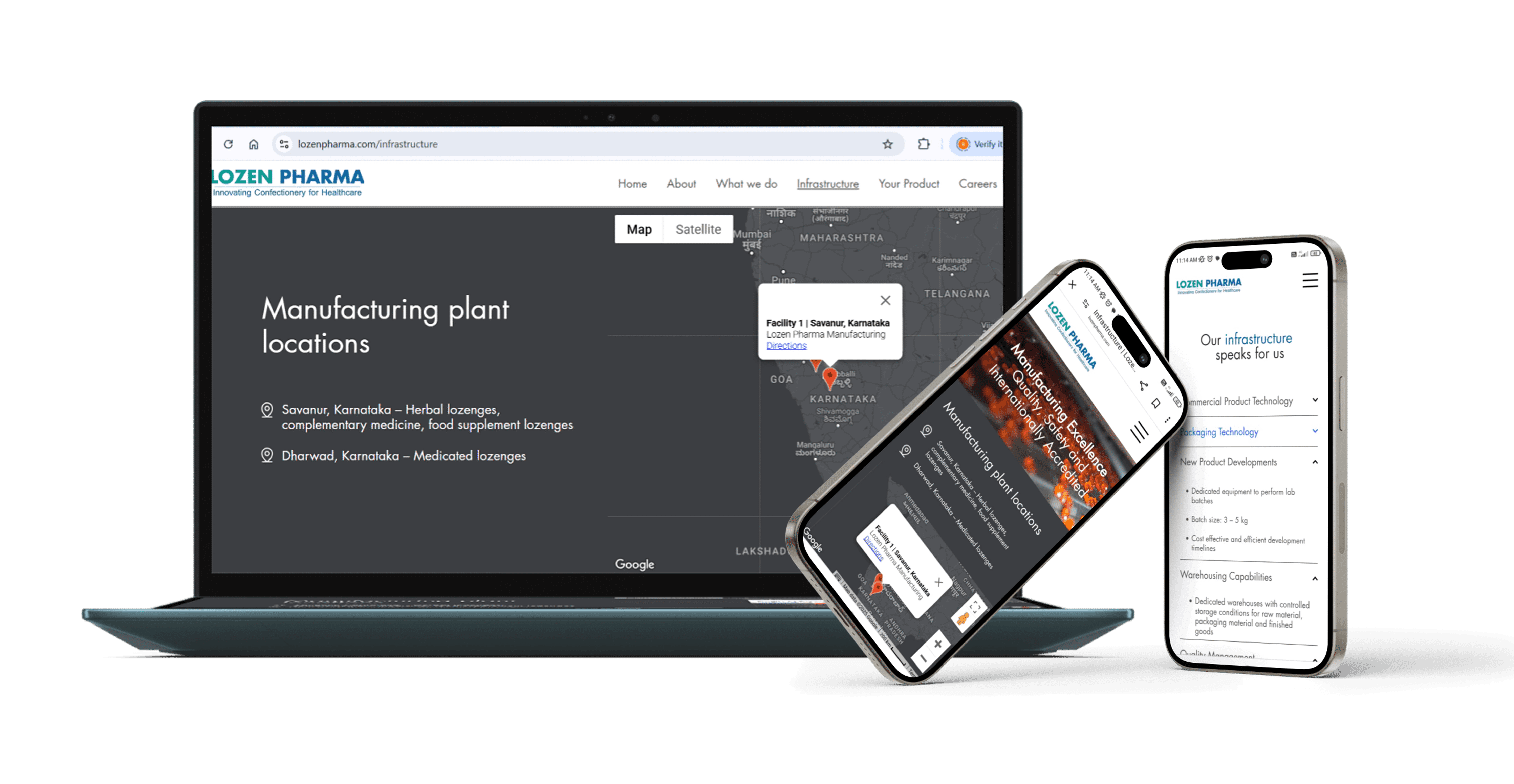
03. Contextual Credibility Mapping
Utilization of a streamlined layout and live mapping to provide an instant, transparent overview of manufacturing location, technology, and quality management.
04. Interactive Lead Funnel
This feature uses a step-by-step product builder guiding users through ingredient and packaging selection to transform complex customization into a high-conversion lead generation tool.